March 30, 2017

Housing market activity in Auckland, New Zealand, slowed in March

Auckland house sales activity quietened in April after a busy March, with only a marginal increase in the average price, and sales numbers down significantly. The latest data from agents Barfoot & Thompson shows that the average price in April was $878,599, up 0.8% from March and up 8.6% compared

Read More »

Randgold shares fall after output dips

©Bloomberg Randgold Resources shares fell sharply from record highs after the miner said it had endured one of its “toughest quarters in years”. The Africa-focused gold miner has been one of the beneficiaries of renewed investor interest in precious metal stocks this year, buoyed by gold’s perceived status as a

Read More »

APL Awards 2017 Has Announced its Supreme Winner

The APL Awards 2017 has announced its Supreme Winner in their annual awards ceremony that has been sponsored by Bradstone. The award ceremony took place on Friday 17th March at The Brewery, London. The event is intended to celebrate the outstanding landscape that has been created by members of the

Read More »

Mansfield Has Been Progressing After the Signing a Funding Agreement

A mixed-use development in Mansfield has been progressing after the signing a funding agreement with the Homes and Communities Agency. This multi-million-pound development has taken a step forward as Berry Hill Mansfield has been awarded £8.5 million in funding from the HCA as part of a scheme that should provide

Read More »

Lendlease Has Introduced a New Property to its Portfolio

It has been announced that Lendlease has introduced a new property to its portfolio. The most sustainable residential developer in the UK has launched new innovative eco-concept. Futurehome is a project that is said to be a large step forward in the growth of the residential developer’s residential business. The

Read More »

Maximising the Use of Communal Spaces in the Office

In recent years, offices have started to embrace flexible working and different working styles. In an effort to increase productivity and staff satisfaction, a strong emphasis has been placed on communal areas. Whether it’s a breakout area for collaboration or just a chillout area for staff to escape their desks

Read More »

Colours Everybody is Going to Talk About in 2017

Comfortable, composed, confident. That’s how Behr, one of the leading colour brands, named their new collections, designed to fit your personality and be an inspirational part of your life with the new colour trends for 2017. The comfortable palette is powdery and pastel with different tones of muted pink, purple

Read More »

Vilnius Old Town – UNESCO World Heritage Site

Vilnius – the capital of a small country named Lithuania and the greenest city I’ve ever been in. It is the city of architectural division and dynamic with the historical old town and modern industrial part. But tall skyscrapers with picturesque views you can find nearly everywhere nowadays, but not

Read More »

Somebody Calls it a Russian Manhattan

Somebody calls it a Russian Manhattan, somebody thinks it doesn’t suit the overall appearance of the city. An idea that is either adored or hated, there is just no one who would be indifferent to it.   The most scandalous, the most controversial, and certainly the most striking capital project from

Read More »
Latest Issue
Issue 323 : Dec 2024

March 30, 2017

Housing market activity in Auckland, New Zealand, slowed in March

Auckland house sales activity quietened in April after a busy March, with only a marginal increase in the average price, and sales numbers down significantly. The latest data from agents Barfoot & Thompson shows that the average price in April was $878,599, up 0.8% from March and up 8.6% compared to April 2015. ‘Auckland house prices have pulled back from breaking into new territory. For the past year we have been looking at monthly year on year increases of around 12%,’ said Peter Thompson, Managing Director of Barfoot & Thompson. He pointed out that sales numbers at 944 for the month were also down significantly, falling 29.6% on those for March and down 11.8% on those for April last year. It means that in April the firm sold the lowest number of homes we have sold in an April in four years, and the likely cause of this was caution around current pricing and the low number of properties on the market, restricting choice. The data also shows that the median sales price for the month at $820,000 was up 2.8% on that for March and also up 8.8% on that for April last year. ‘In part, the climb in the midway price point (median price) can be attributed to the low number of homes sold in the month for under $500,000. In April only 7.1% of all homes sold were in this price category compared to 10.9% in March,’ Thompson said. He also pointed out that while house sales above the $1 million mark were the second highest for seven months, overall, activity in April could best be described as restrained. New listings in April at 1,496 were down 20.2% on those for March and down 5.3% on those for April last year. April’s new listings were the lowest in an April in three years. ‘For the third consecutive month the number of properties on our books at month end declined, and at 2,846 fell 8% below where they were at the end of March. The number of homes on our books at the end of April was the lowest they have been in an April for more than 15 years,’ Thompson explained. ‘While choice across all price segments was low, interest in top end homes remained high, and 355 properties, or 37.6%of all homes sold, attracted a price in excess of $1 million,’ he added. BOOKMARK THIS PAGE (What is this?)      Source link

Read More »

HSL: Improving your Health Related Risk Assessments – HSL Buxton, 29 Sept 2016

Book Course HSL is to run a 1 day course on Improving Your Health Related Risk Assessments. 17 November 2016 It is now widely recognised that occupational disease causes far more harm in Great Britain than accidents relating to safety failings. Good quality risk assessments for health related issues are central to effective health risk management. However, there is often less confidence and understanding amongst general health and safety practitioners when it comes to the ‘health’ side of health and safety. This course is designed to help the general H&S practitioner better understand the ‘invisible’ risks associated with hazardous substances, noise and vibration and aims to provide a more confident approach to these issues.  The course will explain how to conduct risk assessments to meet legal requirements. More importantly, the course will explain how risk assessment should fit into an overall risk management programme. We aim to debunk the myth that risk assessment is a pointless, bureaucratic burden by showing that effective actions to reduce harm, and protect the health of workers, should all flow from an effective risk assessment process. Risk assessment to meet the requirements of: The Control of Substances Hazardous to Health (COSHH) Regulations The Control of Noise at Work Regulations The Control of Vibration at Work Regulations The role of risk assessment in effective health risk management: How to identify health risks How to prioritise action How to ensure effectiveness of risk assessment Anyone responsible for managing health and safety risks in the workplace would benefit from attending this course. The course will be run at the Health & Safety Laboratory in the spa town of Buxton. Buxton is in the heart of the Peak District and has good links to mainline train stations and Manchester International Airport. Details of hotels in the Buxton area can be found at www.visitpeakdistrict.com The cost of this course is £450 per person (includes course notes, lunch and refreshments). Book Course     Please note the invoice option is not available within 4 weeks of the course date, or for overseas customers.  If you are selecting the invoice option for payment, it will be mandatory to input a purchase order/reference number as we are unable to process booking forms without this. For further dates and additional information email: training@hsl.gsi.gov.uk or contact the Training & Conferences Unitat HSL directly on +44 (0)1298 218806. Back to Health & Safety Training Courses Back to the top Source link

Read More »

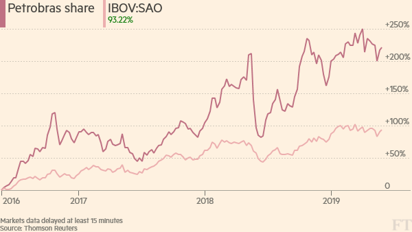
Randgold shares fall after output dips

©Bloomberg Randgold Resources shares fell sharply from record highs after the miner said it had endured one of its “toughest quarters in years”. The Africa-focused gold miner has been one of the beneficiaries of renewed investor interest in precious metal stocks this year, buoyed by gold’s perceived status as a haven from economic turmoil. More On this topic IN Mining But Randgold said operational issues at two mines led to a fall in production in the second quarter of the year. Net income fell 8 per cent quarter on quarter in spite of a higher average gold price. Shares in the company fell more than 11 per cent in morning trading in London. The FTSE 100 miner said it expected to meet its targets for the year, which include producing at least 1.25m oz of gold, after production of 573,000 oz in the first half. “All our teams have been reworking and optimising their mine plans to ensure that we end 2016 within guidance,” said Mark Bristow, chief executive. “We’re intensifying our focus on critical operational issues to ensure that we deliver a substantial second-half improvement.” While Randgold did lift gold sales 2 per cent quarter on quarter, production fell 4 per cent on the same basis after a mill breakdown at Tongon in Côte d’Ivoire and lower grades and recoveries at Kibali in the Democratic Republic of Congo. Costs per ounce of gold recovered rose as a result. Net income for the first half of the year was $123m, 11 per cent up on the same period in 2015. The miner’s targets for this year also included keeping its cash cost of production under $630/oz. In the first half of the year cash costs were $687/oz. Before Thursday’s results Randgold’s shares had risen 35 per cent in the past three months and more than doubled this year. They surged after the UK voted in favour of leaving the EU in June. Tyler Broda, analyst at RBC Capital Markets, said in a research note: “The operational momentum at Randgold continues to slow. Although the market was expecting weak performance at Tongon and potentially at Kibali, both of these mines were worse than we had expected. “The key question for investors today will be how much could the stock derate as we expect consensus forecasts are likely to fall.” Copyright The Financial Times Limited 2016. You may share using our article tools. Please don’t cut articles from FT.com and redistribute by email or post to the web. Source link

Read More »

APL Awards 2017 Has Announced its Supreme Winner

The APL Awards 2017 has announced its Supreme Winner in their annual awards ceremony that has been sponsored by Bradstone. The award ceremony took place on Friday 17th March at The Brewery, London. The event is intended to celebrate the outstanding landscape that has been created by members of the APL. The Creative Landscape Co was announced as the Supreme Winner for its project Garden for Country Cottage and Barn which is found in South Stoke, Oxon. The design by Creative Landscape Co was also announced as the winner of the Overall Design and Build category of the ceremony. The purpose of the garden was to create the right outdoor space that can meet the needs of modern family life as well as maintaining the cottage style of the garden and make sure it is in keeping with their surroundings. The clients needed a garden within an existing walled area that could connect the cottage and barn as well as needing a space for their family and dog. The judges for the APL Awards have stated that the design as properly suited to the scheme and also uses the structural planting in a way that gets the most out of the garden. This project was difficult as the wall of the house provided an angle that changed the symmetry and geometry of the space so finding a solution that looked good and was harmonious with its surroundings was a challenge. This year the APL Awards experienced a record number of applications for the judges to take a look at. That judging panel included Richard Barnard who was chief judge and was working alongside Bob Sweet, Steve Smith, Robin Templar-Williams and Phil Tremayne, the APL’s National Business. At the awards ceremony, 330 audience members heard the winners being announced and also listened to the Landscape Designer Adam Frost.

Read More »

Mansfield Has Been Progressing After the Signing a Funding Agreement

A mixed-use development in Mansfield has been progressing after the signing a funding agreement with the Homes and Communities Agency. This multi-million-pound development has taken a step forward as Berry Hill Mansfield has been awarded £8.5 million in funding from the HCA as part of a scheme that should provide much-needed homes for West Nottingham, and will also create jobs and business opportunities through the development of their new innovation park, as well as varied land opportunities which will include retail and leisure facilities. The Lindhurst Group is the developers for Berry Hill Mansfield and are pleased that the project has received backing from the Homes and Communities Agency when delivering the development. Berry Hill should provide a significant boost to the economy by creating up to 4,000 new jobs. These new jobs will also be delivering homes that are urgently required in order to meet demand. The development will create a brand new community for Nottingham area. The £8.5 million loan that has been agreed will ensure that 1,700 much needed homes will be built in Nottingham. This funding will provide the infrastructure needed to make sure the building goes ahead. The Lindhurst Group will develop 480 acres of land that are located on the boundary of Nottingham and Mansfield. This development will deliver an urban extension to Southern Mansfield. The scheme will include land that will be used for hi-tech research as well as development facilities, offices and accommodation for industrial uses. There will also be a new primary school, a children’s nursery as well as a health centre and care facilities. The infrastructure that is associated with the first phase of the developments have now begun. Work to build the houses is expected to start later this year. The first phase of the development will see 500 new homes built.

Read More »

Lendlease Has Introduced a New Property to its Portfolio

It has been announced that Lendlease has introduced a new property to its portfolio. The most sustainable residential developer in the UK has launched new innovative eco-concept. Futurehome is a project that is said to be a large step forward in the growth of the residential developer’s residential business. The new property also emphasizes the company’s focus and commitment to the area of sustainable urban development. Futurehome is a new concept that delivers an advanced and low energy design for homes that are expected to stand the test of time. Futurehome is a collection that will launch later this year. The collection forms part of Lendlease’s flagship zone one, a regeneration project in Elephant & Castle, Elephant Park. Within this project there are 15 properties which have a Victorian townhouse style, while also being within zone one of London and having the Passivhaus efficiency reading, the world leading energy efficiency rating. This energy standard was developed in Germany and is the most highly regarded accreditation in the world. Elephant park’s Futurehome is the first to receive the Passivhaus accreditation in zone one of London. The ability to integrate the standards required for Passivhaus in to time-honored design is an attempt to combine building methods that increase sustainability while remaining suitable for the urban living all within one single design. Futurehome does this because it is the product of over 60 years’ experience in sustainable development and also displays the next step towards providing leading sustainable regeneration projects for Lendlease. Being able to include advanced Passivhaus standards to their classic designs is a bonus for the sustainable redeveloper. The Elephant Park development is the only project in the C40 Cities Climate Positive Program. This makes the project one of the most sustainable projects with in the urban regeneration sector in the country.

Read More »

Maximising the Use of Communal Spaces in the Office

In recent years, offices have started to embrace flexible working and different working styles. In an effort to increase productivity and staff satisfaction, a strong emphasis has been placed on communal areas. Whether it’s a breakout area for collaboration or just a chillout area for staff to escape their desks and have a break, communal spaces are becoming an essential part of office design. In the age of Wi-Fi, people can freely move around the office and discuss projects with their colleagues. To collaborate and work effectively together, people need a space to meet, which is why the communal working area is rapidly increasing in popularity. Allow for flexible working with modular furniture Modular furniture is pre-made or ready made furniture which can be used according to needs and room spacing. It’s easy to install and dismantle, which makes it great for communal areas, which can grow or decrease in size according to your requirements. The great thing about modular furniture is the easy creation of a wide variety of space-saving configurations. Because it is available in a broad range of designs and styles, it gives a modern look to your office and can be adapted to suit your brand. Modular furniture is specifically designed to expand as your company grows and makes it easy for workers to collaborate. Demountable walls and partitions can be reused and moved into alternate configurations to maximise space according to the occasion. AAT (The Association of Accounting Technicians) is one company that implemented modular seating and low-level partitions to facilitate better staff communication. They also installed modular solutions in the creation of a central meeting Hub which improved morale and staff retention. Make your communal areas fun to encourage creativity When designing communal spaces, there’s one group of people who should be at the forefront of your mind: your employees. Design with your employees in mind as Steve Jobs did when he was involved in the redesign of Pixar Studios. He mixed up employees to allow ‘unplanned collaborations’ to take place and commented, “We designed the building to make people get out of their offices and mingle in the central atrium with people they might not otherwise see.”  Likewise, Google has a rule where people can be placed no more than 150 feet from food, which encourages employees to collaborate in the many kitchens and dining areas. The decor should also be fun and represent the values of your company. Create different zones If your space is big enough it’s great to create different communal zones for different purposes. For example, one could have a table area for laptop work, another could comprise a social area with a bar, snacks and table football, and at the opposite end of the spectrum a quiet area with comfy chairs and industry books for reading and research. You can be as creative as you like with these areas; perhaps you prefer amphitheatre bench style conference facilities for internal meetings, presentations and brainstorming with large groups or maybe a central tea point between all departments. Our designers created a ‘shabby chic’ theme throughout EDC Communications open-plan office with different zones and seating areas built around central meeting rooms, including a space with table football and books. Focus on ergonomics Just because people aren’t using their desks, it doesn’t meant that they won’t need a comfortable environment in which to work or relax. If you go for ‘funky’ seating such as bean bags, don’t forget to address the balance with some supportive furniture. Accessories such as tablet mounts will help to ease the aches and pains associated with using wireless devices for long periods. Install a range of desks and seats so that people can move around and find what’s comfortable for them. Don’t forget to fit some standing desks for people who want a break from sitting down. NTT Data UK has a staff that mostly consists of consultants, so we made sure they had access to a variety of seating and standing desks throughout their offices at the Royal Exchange in the City of London. Install a communal wall Innovative companies like Facebook and Google are hugely desirable workplaces for young and creative people. They have at least one thing in common: they have all established areas where staff can share their ideas. These areas are usually white/blackboard areas where employees can brainstorm in an informal environment and write down spontaneous ideas that can be developed in a collaborative environment. We fitted a large blackboard in a open space for EMO & TRA marketing company. It allows for informal brainstorming and collaborative work, which fitted their objective to encourage creative thinking. This idea can be further adapted with pin boards or magnetic boards so that visuals can be displayed clearly. clippings, photographs, mood boards and anything else can be clearly seen. The installation of power modules or wireless chargers can keep people connected to check facts or look things up while they’re brainstorming. If you would like Interactive Space to help you maximise your communal space,  get in touch with their team of experts.

Read More »

Colours Everybody is Going to Talk About in 2017

Comfortable, composed, confident. That’s how Behr, one of the leading colour brands, named their new collections, designed to fit your personality and be an inspirational part of your life with the new colour trends for 2017. The comfortable palette is powdery and pastel with different tones of muted pink, purple and blue. It is soft and feminine and will be a good choice for a light interior, where composed palette is more dim and dusky with deep blue-green colours –  an excellent choice to emphasize the décor, not the room itself. Quiet and sophisticated, it is a top pick for a modern, edgy look for this year. Confident palette, on the other side, contains quite an accented colours, which definitely stand out of the three palettes. Bright and saturated, risky, but fun, they will liven up any interior and can be used to add a drama point where needed. In general, all the colours look great and the palettes are combined well, but there are some colours, which should be discussed in more detail. Dusky grey / Shades On Grey interiors are becoming more and more popular. Elegant and sophisticated, it is quite a controversial colour, as some people find it depressing. But for somebody else it is a serious one which carries a certain meaning, as it is usually seen as a colour of the industrial environments, it can convey a message like “I mean business”. But no matter how classy it can look, in case of psychology and human’s perception of colours, grey is the only colour that doesn’t have any positive impact, thus a splash of bright colours should be used in a décor. According to Karren Haller, colour and design consultant, it is best to avoid grey in bedrooms, nurseries and any other room where creativity is required, as it can be draining and tiring. In other cases, where you want your interior to be subtle and dim, grey denim and accompanying palette will suit the needs. It is modern, sublime and universal. Powdery pink / Life is a Peach Pantone named “Rose Quartz” the colour of the year in 2016 and what a year it’s been for pink colours so far! And it looks like pink themed colours continue to defend their position in the new year as well. Even though it is a more gentle and feminine colour, don’t be trapped by gender stereotypes. Loved by men, women and children, it is a soothing and comforting colour, perfect for creating a calming space.  When using pink colours in the interior, it gives life-giving effect. You don’t need necessarily dye all the walls with it, the reflection of blankets, pillows or furniture will be enough to achieve this freshness. And it actually goes well with a lot of colours, especially a good complement for pink is grey, ecru and forest green. Green / Wanderlust Green colour is the symbol of nature, it creates space for leisurely relaxation and can bring a piece of outside into the inside space. Dark greens and emerald will also be popular during this year. Emerald, as well as royal blue, are symbols of wealth and luxury. Properly used, it creates an expensive look, even if it didn’t cost much. But just as with any other colour, overusing it will not lead to anything good. If the apartment is situated in the busy city centre, it is a great idea to brighten it up with lighter tones of green, not only for nice interior, but for the calming mood as well. Green, similar to blue, is perceived as relaxing and reassuring, it basically tells us what we are safe.  Even though it sounds so majestic and is easy on the eye, it is quite challenging in the interior design. You should really think through which colours you will combine with it or which other shades of green you could use. There are methods on how to discolour it, or tint it with some white or grey to remain the psychological effect of this colour in your home, but to avoid decorating pitfalls. There also other tips and tricks, like adding a complementary colour in your green paint to add depth and complexity and turn your home into the oasis of tranquillity, nature and comfort. When making the decision on the colour, you should consider the size of the room, the position of the room, which implies if sun is entering the room and at what time of the day, and what activities will take place in this room. But don’t make your decision based on others judgement. Embrace the colour of your choice because of how it speaks to you and how it makes you feel. Colours are deeply connected with psychology and each colour has a specific influence on our mental, emotional and physical condition.

Read More »

Vilnius Old Town – UNESCO World Heritage Site

Vilnius – the capital of a small country named Lithuania and the greenest city I’ve ever been in. It is the city of architectural division and dynamic with the historical old town and modern industrial part. But tall skyscrapers with picturesque views you can find nearly everywhere nowadays, but not the old town – such places are exceptional. It is just a pleasure for the soul to be in this city, take long walks through those small cobbled streets, with gorgeous buildings around you, enjoy the nature, the architecture and the view of the warm lights and cosy cafes. Especially in winter, when it is minus twenty degrees outside, you freeze nearly to death, but the falling snow makes it look like a magic place from a fairy tale. Truly fascinating and inspiring place. The town itself began to develop in Middle Ages, thus you can find many different styles in the architecture of the Vilnius Old Town and here are the most prominent ones: Gothic  It is the architectural and art style of the mature and late medieval periods which was formed in France and reached Lithuania in the late part of the fourteenth century. This style is full of antinomy: symbolic, allegorical content and naturalistic visual detail, spirituality, mysticism and logical structure. In Lithuania, Church of St. Francis and St. Bernard is one of the largest sacral gothic buildings, but the most significant gothic monument is St. Anne’s Church. Both are located right next to each other in The Old Town of Vilnius, but one of them outshines the other. St. Anne’s Church is the most impressive building not only in Vilnius region, but throughout all Lithuania. None of the other gothic buildings can match with its elegance and richness of details, it is truly a masterpiece, which survived a lot of historical moments and was reconstructed multiple times. The St. Anne’s Church and the whole old town of Vilnius has been on the UNESCO World Heritage List since 1994, but the Church itself was also brought to the CyArk database in 2010.  Renaissance  “Rebirth” or renaissance is the period in the European history which served as a transition from Middle Ages to modern history, a kind of cultural bridge. It spread throughout Christian Europe in the fifteenth – sixteenth centuries, replacing the medieval gothic style and brought mixed forms into fashion such as arches, columns and pilasters – the slight impact of antient heritage. Renaissance in architecture was brought to Lithuania by Queen Bona Sforza, wife of Lithuanian Grand Duke and King of Poland Sigismund I the Old. As she was an Italian, she was inviting her countrymen architects to Vilnius, who gave the city an Italian Renaissance character. The most popular places to see in Vilnius in this style are The Gate of Dawn, which contains an icon of The Blessed Virgin Mary Mother of Mercy and it is said that the icon has a miraculous power, which is why many pilgrims from neighbouring countries are travelling to Lithuania to pray in front of the holy painting. Also, the Palace of the Grand Dukes of Lithuania, The Bastion of Vilnius City Wall, Alumnat courtyard, House of the Signatories and many others.  Baroque Baroque is an art direction which originated in Rome during the late Renaissance and reached Vilnius in between sixteenth and seventeenth centuries. It resisted to classicism and rationalism with its bizarre, strange and prone to excesses look and amongst other styles, baroque is an integral part of the architecture of the Old Town of Vilnius. The most outstanding examples of Vilnius Baroque are St. Catherine Church, St. Theresa Church and St. Peter and St. Paul’s Church. And I just can’t not mention Vilnius University. Baroque not only left the architectural heritage, but also left a significant imprint on painting, literature and applied art. It swept across Vilnius with all its power and greatly influenced the appearance of the city and its further development. Classicism  This is a grand style with its inherent columns, mouldings, pediments and balustrades. Large, bright building, spacious squares with a well-planned gardens and parks. It became popular in Europe only in eighteenth century, but its origin is ancient art. Like during the Renaissance, this is a comeback to the ancient architectural principles – simplicity, clarity, monumentality, rigor, use of classical compositions and ancient harmony. The most prominent buildings in Lithuania are built in this architectural style such as Presidential Palace, National Museum of Lithuania, Vilnius Town Hall and Vilnius Cathedral. The Old Town of Vilnius is an eye pleasing place with a great amount of beautiful churches, impressive constructions and architectural masterpieces. No wonder it attracts a considerable number of tourists each year. A truly worth to visit place, and not only in winter. During the summer, there is a lot of street musicians, who will turn your simple evening promenade into the romantic rendezvous.

Read More »

Somebody Calls it a Russian Manhattan

Somebody calls it a Russian Manhattan, somebody thinks it doesn’t suit the overall appearance of the city. An idea that is either adored or hated, there is just no one who would be indifferent to it.   The most scandalous, the most controversial, and certainly the most striking capital project from the architectural point of view. “Moscow city” caused such disputes and such polar opinions and appraisals, like no other building development did. It is the most ambitious and unique architectural complex of the capital. The first plans of the design of Moscow International Business Centre (MIBC) were presented in 1991, and by the 2016, twelve of the twenty-three planned facilities have been built, seven buildings are in a construction process and four in the designing stage. Overall, the whole project will take around 100 hectares of the land which will consist skyscrapers, parks, parking lots, landing areas for helicopters and more. And the amount of investments is already approximately $12 billion. At the beginning, it was planned that the centre of the whole building development will be a large green park with a car park underneath. And all the buildings will be located around the park in a form of a horseshoe, spirally increasing from the lowest to the highest. Now, instead of a green park, the centre of a “Moscow city” took the largest, in terms of land space, building: a shopping mall – “Afimall City”. Also, each building was supposed to have each own architect, who would invest in the project their own ideas about modern living. However, this also didn’t happen, as the actions of the architects are being dictated not only by their own ideas, but also by the appetites of clients and investors. However, “Moscow City” still is an architectural phenomenon of the capital, designed by the most famous architects and the whole architectural firms of the world. It definitely stands out with its creativeness, uniqueness and spectacular buildings. Evolution Tower The tower “Evolution” was recognized as the best realized project in terms of a glass use and glass constructions at the “Glass in Architecture 2015”, Russian architectural competition. The building is certainly one of the most significant cites of the project, visually it makes an impression as if it would rotate around its axis by 156 degrees. It was designed by British architect Tony Kettle, managing director of the international architectural firm RMJM. He also designed Moscow’s “Domodedovo” airport, terminals 2 and 3, but his most impressive work is Lakhta Center in Russia. Imperia Tower Laconic, but at the same time extremely unusual, “Imperia” is unlike any other building in the wold. It was designed by the global architectural company NBBJ. NBBJ has their offices all around the world and there are many impressive designs on the company’s account, such as: Lincoln Financial Field, University of Washington, Paul Brown Stadium, Telenor, Swedish Medical Center, Reebok World Headquarters and more. They are also currently working on a new building for Manchester university, which will be a home for over 500 scientists. Interesting fact about “Imperia Tower”, it contains the highest hostel in the world, which is located on the 43rd floor of the building. Capital City Another creation of NBBJ is Capital city – the third largest building in Europe, consisting of two towers. Very interesting and unusual architecture of the building definitely attracts an attention. It is shaped in the form of blocks, placed offset relative to each other, thus the design of the towers creates a sense of movement and dynamism. In 2011, “Capital City” became one of the top ten “most aesthetic” skyscrapers in the world. Naberezhnaya Tower The only tower made in hi-tech style. The special feature of this building is the lack of glass on the technical floors in the two of three buildings. It creates an illusory deception of fragility of the buildings, where in reality it only gives them strength. Federation Tower This complex of two skyscrapers united by a common stylobate is the tallest building in Europe and has the best panoramic view on the city of all the towers.  It is designed by a collaboration of Russian and German architects Sergei Tchoban and Peter Schweger. During the creation of the towers, was used a custom-designed concrete B90. It strength level is so high, that even after a direct plane crush, the towers will remain intact. Eastern part of the building consists of 95 floors and reaches 374 meters in height. And in the west tower, there is a restaurant named “Sixty”, where every hour opera music is switched on and windows are hydraulically raised. At these moments, you can see the spectacular view of the city, without a glass as a barrier, from a height of about 200 m. At this altitude, the air is absolutely clear, as all the smog remains at the bottom. Mercury City Tower Probably the most eye-catching tower of all the towers in “Moscow City”. No wonder in 2013, “Mercury City” won the prestigious “International Property Awards Europe” in the category “Best High-rise Architecture”. Designed by Russian and American architects: Mikhail Posokhin and Frank Williams, Mercury Tower has an unusual shape and copper-golden colour tinted panoramic windows, which allow the construction to stand out from even the most unusual buildings in the city. OKO This building consists of two towers, united by a single, crystal shaped platform. The basic concept consists of simplicity of geometric shapes, as well as its smooth integration into a modern space of a centre of Moscow’s business life. It was designed by US architectural company Skidmore, Owings and Merrill LLP (SOM). Grand Tower, Neva Towers, IQ quarter, which is another project of NBBJ architectural firm, Eurasia Tower and Northern Tower where also already been built, as well as Tower 200, which is the first building of all the building elements in MIBC and was designed by the Soviet Russian architect Boris Tkhor, the one who the general idea of the City belongs to.

Read More »