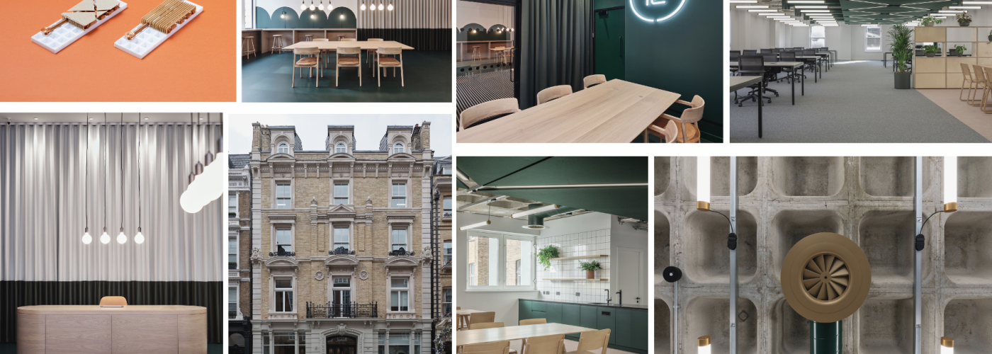
White Red Architects completes striking, 9,000 sqft office refurbishment in the heart of historic Covent Garden, at 12-13 Henrietta Street. 12-13 Henrietta Street comprises the refurbishment of speculative office space for client Royal London, including a new reception and common parts, taking inspiration from the surroundings and the nearby London Transport Museum.
White Red Architects’ aim was to give this historic building back some of its personality; a stronger character that would connect it positively with the people that work there. They decided to step back from the traditional approach of focussing on the office floor plate and instead designed the shared reception as the centre of the proposal.
“We didn’t want this to be just another indistinct, speculative office project. There was an opportunity in this historic building to tackle the challenge of office refurbishment differently and create something that prospective users might be really fond of. We were determined to adopt a daring design in this prestigious location and were grateful that our client embraced this approach,” added Joe Haire, director at White Red Architects.
The shared reception area forms the centre of the proposal. Being visible from the street and the first space you enter it is vitally important to the building. It has been designed to double-up as both a traditional reception, controlling the flow of people into the building, but also as a space that invites you to wait, to socialise or work, making it a natural extension of the office spaces above.
A generous solid oak ‘dining’ table occupies the centre of the space inviting groups to sit and talk while more discreet high benches around the perimeter and in the windows are placed for individuals to sit and work. This activity in the building’s entrance makes for a more attractive space to spend time and activates a previously dormant facade.
Colour and shape have been used to add character. Racing green is already present throughout much of Covent Garden and this classical colour has been carried through the building in paint, floor resin, handmade tiles and acoustic panels, linking the spaces together. The distinctive arches that line the reception come from the beautiful Victorian ironwork of the semi-circular green windows of the London Transport Museum nearby.
Also key to the character of the building is its historic facade. After years of neglect and pollution, the stone mouldings, brickwork and metalwork had dissolved into the background. The facade was thoroughly cleaned, brickwork repointed with lime mortar and the metalwork repainted, bringing the frontage back to life.
The central attribute of the office floors is the racing green ductwork with golden ‘top hat’ diffusers against the structure of the concrete waffle slab above. Exposing structure and services is not typically seen in commercial spaces in this more traditional part of Central London, and so it was crucial that this was designed and set out neatly. White Red Architects worked closely with the M&E consultant in Revit to design and model every conduit, duct and detector. These were reflected in the developing CGIs and passed on to the Contractor during construction allowing the team to collectively control the process and be confident of the outcome. The services are fed by a central spine running down the centre of the long floor plates, concealed with a raft of acoustic panels. These panels are made entirely from recycled plastic bottles.
The fit-out and finish of the two office floors were approached differently. The third floor is finished as far as Cat A and more traditionally without colour, whilst the second floor is finished to Cat B, in full colour and includes meeting rooms, floor finishes, kitchen, desks, sofas and storage. This is the show floor and immediately ready for a prospective tenant to move in and start work. The furniture and furnishings have been selected in line with the character of the design and offer something bolder and more adventurous in what is typically a very reserved office market.


