Although flyers are a communication tool that exist for some time, even today they are still being successful thanks to their ease of use and the advantages and benefits they offer to a company. Successful flyers only need one thing to work: an attractive design.
When it comes to publicizing your business or building project, you have to use advertising methods to reach a wider audience. Flyers are a great and relatively cheap tool. Creating an attractive flyer is not always easy, but luckily there are a number of keys you can take into account to make a successful design. A design that, with a single glance, shows the user what you want to transmit. And wakes the curiosity of the client, who then wants to learn more about your company or project.
Communicate one message on the flyer
Before you start to design your flyer it is important to have a clear idea of the message you want to communicate. Do you want to invite people to the opening of a new building? Do you want them to come to the presentation of a new building project? Or do you have another special occasion you would like to invite them to? Make sure the purpose of your flyer is directly clear and you have a simple message to communicate. The same as when writing or reading a headline for the newspaper, basic questions should be directly answered like, what, why and when. This way, when your audience takes one glance at the flyer, they know directly what you have to offer.
How to design an attractive flyer
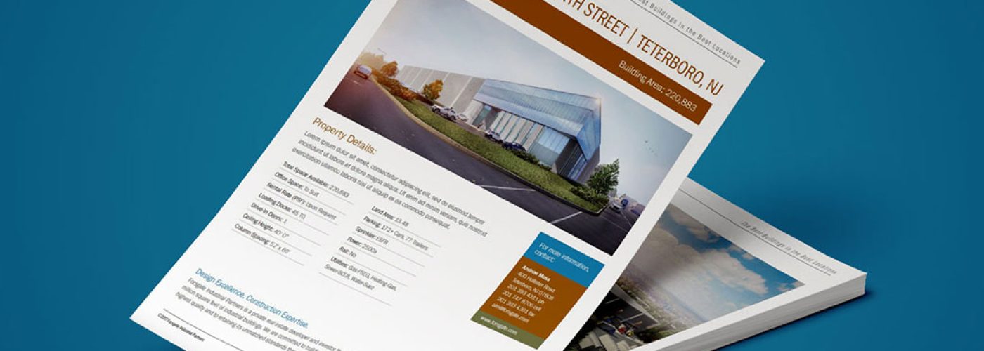
When you start with the design for the flyer you should first choose the measures of it. It doesn´t matter if you want a horizontal or vertical design, just look at what fits your needs. Since hopefully a lot of people will see your flyer, it´s important to choose the right size that suits your message and company. Once you know what shape your flyer will get and you have your message clear, you can start with the design. Don´t overload the flyer with too much information, so the main message isn´t clear any more. The title, in combination with the photo or image you are going to use, can be considered the protagonist in your creation. The title needs to be an attractive phase and the image should be of enough quality that is stays sharp after printing. The colours you use can be seen as a binding method to create a perfect harmony on the flyer between all the elements. And of course, don´t forget to put the specific date on the flyer so people know when the event is happening. Also contact details are essential for people who would like to receive more information.
Spend some time on a great design for the flyer and it will tip the balance in your favour in your marketing campaign to communicate your message in an attractive way to a wide target group!


