


Commercial development booths have one simple objective – to have a visitor understand the project in a short time. Determine what the audience wants to know when selecting furniture and/or display equipment. A property developer may wish to showcase a new office development, retail site, hotel, industrial complex or mixed use project.
Begin with the primary project, and set out its main features. They can be the address, size, purpose and use, significant features, development phase and contact information. Then, determine for each information requirement whether it needs a physical model, a printed graphic, a screen, or a direct conversation.
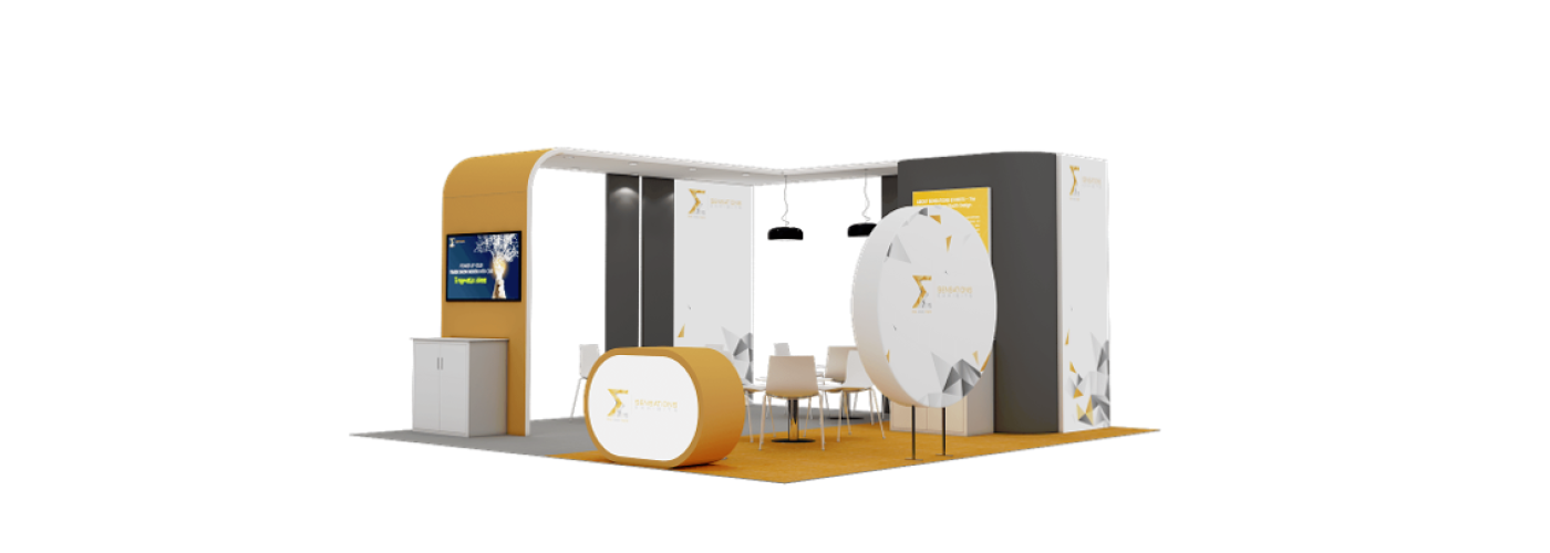
This booth is 20 x 20 which makes 400 square feet, so there is room for several functions. But each area has a definite function. The main project display, information area, meeting space and staff storage are all possible components of a simple plan. It is important to separate these functions so that visitors can walk through the booth without confusion.
How a 20×20 Booth Creates Space for Project Presentation
A 20×20 booth gives commercial development firms 400 square feet to present a project and speak with visitors. The larger footprint allows the company to divide the booth into clear zones instead of placing every display in one area.
The main project presentation should have the strongest position, ideally where people can see it from the aisle. Large renderings, site images, project models, or other visual material can explain the development before a staff member starts a conversation.
A second area can provide detailed project information. Here, visitors can review floor plans, maps, construction details, or development images without blocking people who are entering the booth.
A meeting area can sit farther from the main aisle. This gives staff a place to discuss investment, partnership, leasing, or development questions in a more focused setting.
Storage should also have a planned location. Boxes, bags, spare brochures, and staff belongings shouldn’t become part of the visitor-facing display.
A useful layout can include:
- Main display: the featured development and core message.
- Information area: plans, maps, images, and project facts.
- Meeting area: space for longer conversations.
- Storage: a hidden place for supplies and personal items.
- Open path: enough room for visitors to enter and move around.
Before the event, walk through the planned layout from the aisle. If the main project isn’t visible or visitors have to move around furniture to enter, adjust the design before production.
How Large Graphics Can Present Commercial Projects Clearly
Large graphics can make complex commercial projects easier to understand at a trade show. A development may include several buildings, roads, public areas, floor levels, or different uses. Trying to explain all of these details with small signs can leave visitors confused.
A large wall graphic can provide the first layer of information. For example, a development firm might show a high-quality architectural rendering of the completed project, with the project name and location placed in a clear position. Visitors can then ask staff for more detail.
Site plans are another useful graphic type. A simplified plan can show the position of buildings, entrances, parking areas, roads, and other important features. The graphic should be large enough for visitors to read the labels from a comfortable distance. Detailed technical drawings can be available separately for people who need more information.
Graphics work best when they follow a clear information order:
- Project name — identify the development.
- Main image — show what the completed project may look like.
- Location — explain where the project is.
- Key facts — provide useful numbers or features.
- Next step — tell visitors how to learn more.
A 20×20 booth also gives developers room to use more than one large graphic without forcing everything onto a single wall. One panel can present the overall project, while another can explain a specific building or feature.
Keep text short and readable. Trade show visitors usually view graphics while standing or walking, so long paragraphs are not suitable for the main display. Use short statements, clear headings, diagrams, and strong images.
Fabric graphics can also provide a clean surface for large project images. A framed fabric wall can create a continuous visual area without requiring several separate poster stands. If the display system allows graphic replacement, the same frame may also be used for another project or future event.
Colour choice matters as well. Use the firm’s established brand colours and make sure text has enough contrast against the background. Architectural images should remain clear rather than being covered with excessive logos or promotional text.
Finally, review every graphic at full size before production. Check project names, addresses, figures, labels, logos, and images. A small spelling mistake on a handout can be corrected later; an error on a large booth wall is much harder to ignore.
How to Present Different Commercial Development Projects
Commercial development firms may present office buildings, retail sites, hotels, industrial properties, mixed-use projects, or redevelopment plans at the same event. Each project needs a slightly different presentation because visitors look for different facts.
For an office development, useful content may include floor area, location, building features, access, and available space. A retail project can place more focus on site position, customer access, nearby roads, parking, and planned tenant areas. Hotel developments may need room information, shared facilities, location, and project images. Industrial projects can show building size, loading areas, transport links, and site access.
A 20×20 booth can separate these project types into clear sections when several developments need to be shown. Use one main area for the priority project and smaller displays for additional properties.
Keep each project section consistent. Show the project name, location, main image, key facts, and a clear way to request more information. This makes it easier for visitors to compare projects without searching through large amounts of text.
How Models and Visual Displays Help Explain Development Plans
Commercial development plans can be difficult to understand from text alone. A physical scale model can give visitors a direct view of the relationship between buildings, roads, open areas, and other site features. This is especially useful when the development contains several structures.
Place the model where visitors can view it from different sides without blocking the main path. A raised display surface can also make the model easier to see, although the exact height should suit the model and the expected audience.
Printed graphics can provide information that the model cannot show clearly. A large site plan may identify individual buildings, entrances, parking areas, and public spaces. Architectural images can then show how the finished development is expected to look.
Digital screens can add another layer of detail. A developer might use a short project video, 3D visual, floor plan, or site presentation. The screen should support the physical display rather than compete with it.
A useful combination is:
- Scale model: shows the physical layout.
- Site plan: identifies locations and relationships.
- Architectural images: show the planned appearance.
- Screen: provides additional project details.
- Short labels: explain the most important features.
Accuracy is essential. Renderings and models should be clearly presented as proposed designs when the project has not been built. If plans change, update the displayed information before the event. Visitors should always be able to distinguish between an existing feature and a proposed one.
How a 20×20 Booth Can Support Client Meetings
When space is limited, a 20×20 booth provides sufficient space to have an enclosed meeting area and still have the primary project area available. It is helpful when developers have questions they wish to discuss in detail with investors, property professionals, tenants, partners, or other business contacts.
Locate meeting area away from the most active entrance way. A small table and a few chairs can offer a functional environment without crowding out the stand.
Do not leave project materials very far away from the meeting place. Printed plans, brochures, tablets or screens can be used to help staff respond to queries without taking their eyes off the conversation.
Privacy should be taken into account too. Some separation can be achieved with a partial wall, graphic panel or change of furniture position, yet maintain the meeting area from the main booth.
The meeting space must be purposeful and not just to cover up the empty floor space. A standing counter might be more appropriate than a full table if most of the exchanges are short. For longer meetings, more comfortable seating will be better suited.